To start off my magazine I created the Liver bird which is the Liverpool logo, I did this as it is something Liverpool FC put on the front of there magazines, to do this I simply went around the shape of the Liver bird to get the outline using the pen tool, I then filled it with red for now as that is the Liverpool colour however it is yellow on the kits.

Here I added some of the other details to the bird which was the eye and the moon shape inside the body.

As you can see here I had all the little parts that made up the logo, as I wanted to make it easier and make it an asset I selected the whole image and grouped it so it was all one, I then opened up the assets menu and dropped it in there so it was there when I needed it.
Here you can see it is in the assets menu this means I can access it anytime I want to by going inside the assets menu.

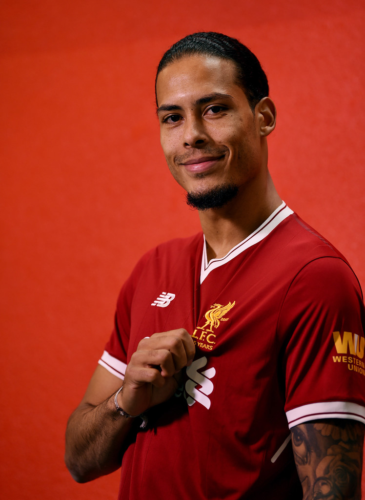
Next, I wanted to go onto making the main feature on the front page therefore I started to create Virgil Van Dijk, I started off by creating a simple A4 sized canvas and then added in an image of him I wanted to trace.

To trace the image I used the pen tool to roughly go around him and then I curved some of the ones I needed to curve afterwards using the node tool.
Here I started to get into the finer details by creating the white stripes on his collar I again used the same method went around the edges with the pen tool and created the curves with the node tool. To colour it I used the Idropper tool which is where you go over a colour and it picks out that colour for you I did this for all of my colouring.
Then I created the whole collar by using the same method as before.
Here I started to finish off the details of the shirt by creating the button by simply using the circe asset, to create a darker tone around it I gave it a slight outer glow, I also created different shades by simply selecting the part I wanted to make darker and going on the colour selector and dragging the red slightly darker.
Here is the finished collar.
Next I started to create the different shades for the rest of the top, for this I used the same technique and made sure I changed the colours slightly to create the different shading in the top.
Here is the finished top, as you can see I also have some black on the inside of the colour this is the shading for what is on the players neck I did this as i wanted to try and make it as detailed as possible, I did this by going around the dark tones with the pen tool and curving it with the node tool and the bit that weren’t as dark I made the opacity lower so it wasn’t as dark.

As I had now done my top I grouped it all to make it one piece of work I did this so its easier to access certain layers whenever I need to.
Here is the process I went through to create the shading around the neck.
I then went on to Virgil to start creating his actual neck and face I started off by creating his neck so I was working from top to bottom. I used the same technique to draw his neck, to get the colouring I used the Idropper to get his skin colour and to add the fade I used the gradient tool and dragged it across and thats how I got his skin tone well.
Now to create his face I simply went around the outline again with the pen tool and the node tool to make the curves, to get the colour I used the gradient tool again and used the Idropper to get the proper skin tone of his face.
I then went around his hair on his head and his facial hair and then went around his ears I used the same technique again by using the pen and node tool.

As you can see now everything is shaded in by using black for his facial hair and head hair, his ears are also coloured to match his skin tone I did this by Idropping over the darkest tone on the right side of his face and then using the gradient tool and Idropping over the lightest part of his face.
To make things less complicated and muddled up I now made the head a separate group therefore again I could easily access everything I needed.
I now was onto the facial features, the lips where hard to replicate with the colour therefore I spent a lot of time trying to layer it and create the different tones in his lips by using the gradient tool and just creating slightly darker layers on some points, I also gave it an outer glow as he does have a slight glow around his lips on this photo.
I then created his nose, this for me was a struggle at first as I couldn’t get it to look real for a while, I tried to see if the shading would work when adding that to the right side of his nose but it still made the rest of the nose look fake, I even tried seeing if I needed to add the eyes and eyebrows to see if that would help, it did in someway but not totally, so I tried one more thing and that was using the paint brush tool so I could blend it in well and it worked good.
As you can see I faded it in till it reached the eyebrows and it makes the nose look so much more real.
To create the eyes and the eyebrows I simply used the outline of his and went around it with the pen and node tool to get the eye shape but i made the pupil of the eye by simply getting a circle asset. The eyebrows where easy as I just went around the edges and filled it in with black as that is the colour of his eyebrows.
As you can see I also added his birth mark as it is another main feature on his face I simply went around it with the pen and node tool and then filled it a darker brown put slightly lowered the opacity and added an outer glow to blend it in better.
Here is the finished Virgil Van Dijk in my opinion it came out really well and I managed to overcome any problems I had by using effects and the different range of tools there are.
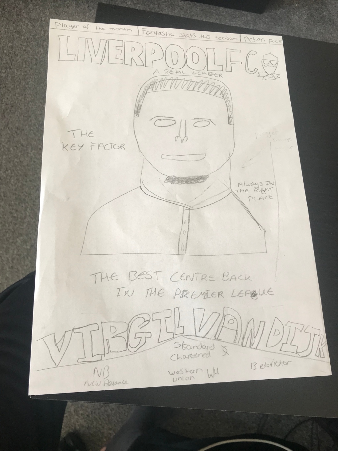
I now started to do the rest of the magazine I started top to bottom again so I could work my way up and know how much room I have have for the main pieces of text around the page, this is where I know came to something that my audience wanted as when doing my primary research they said they preferred a magazine with text on the front page as it draws them in more. I made all of my text yellow and made the font ‘Impact’ font as it is easy to read and similar to what Liverpool use as there font for there magazines. I also wanted the writing to stand out more therefore I gave it a black outline then it could stand out well in the page. As you can see here I did do some repositioning of text as I couldn’t fit it all in to the size I wanted therefore I made some readjustments. I also changed the size of the space in between the letters to 43% to be able to fit it on the page better.
Now I got to the top of the page where I wanted the headings to be as this is what Liverpool magazines do they put the main pages that people would want to see at the top, I made sure I also made this the same font as the rest and made sure it stood out. I created the black and red rectangles by using the rectangle asset.
I now got to the LIVERPOOL FC text and logo that every Liverpool magazine include, I did this and in my head had to look back to my planning as I knew I had done something wrong with the colours as it didn’t go to well in my opinion these colours, I got the Liver bird I had previously made from the assets menu.
This is where I looked back at my research and planning and changed some of the colours around and got my red background and made it two tones of red by using the gradient tool, I changed the logo back to its normal yellow colour and also made the LIVERPOOL FC title yellow to match up, this now looked a lot better.
Here now is my almost finished magazine.

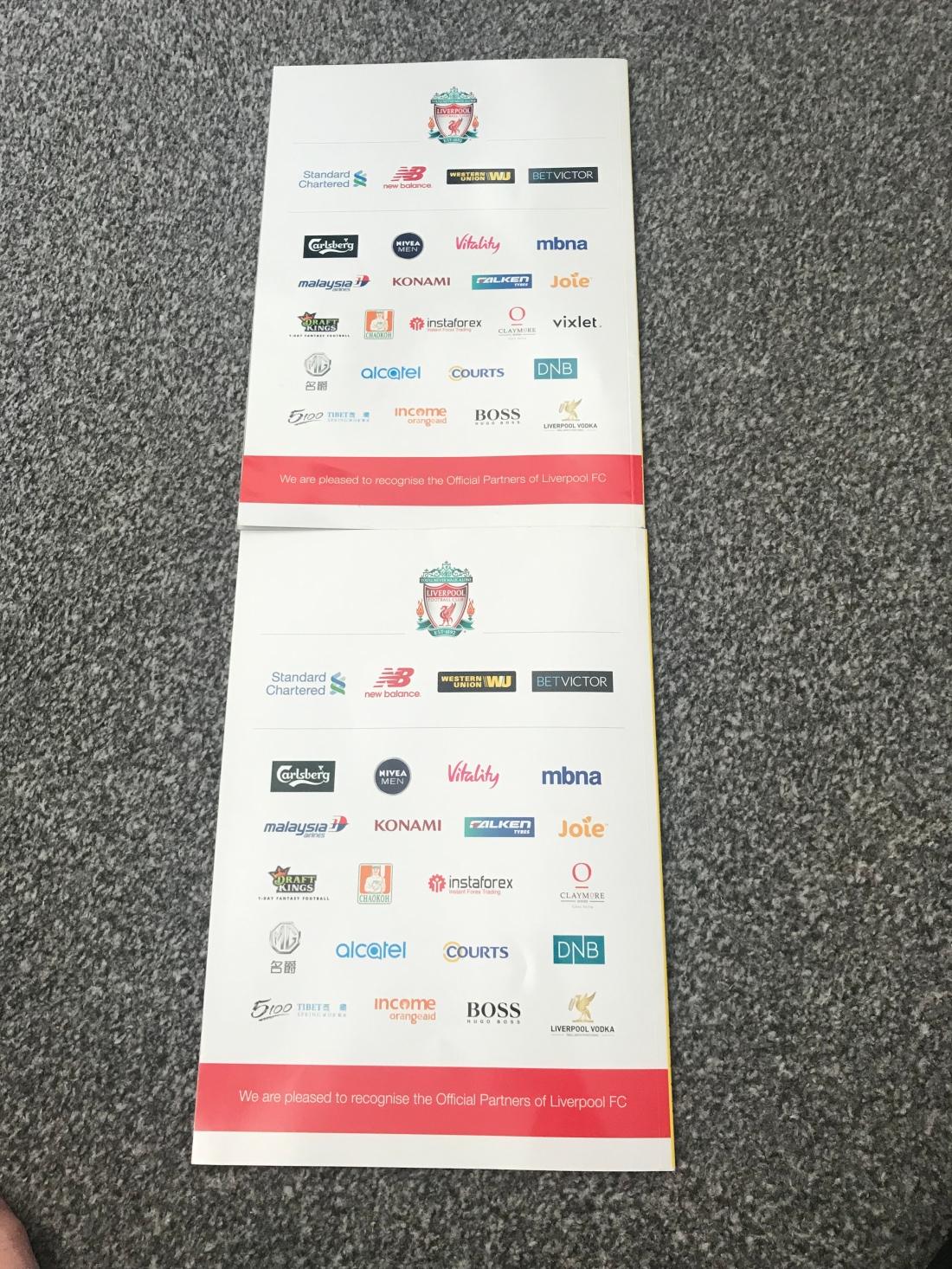
For the final part I needed to put Liverpool’s sponsors at the bottom, I did this by tracing around the outside of the logos and then getting rid of them and using my own graphics of them so everything I did was my own.
Here is my finished front page magazine.









 JC Blogs